Color starts with a measurement
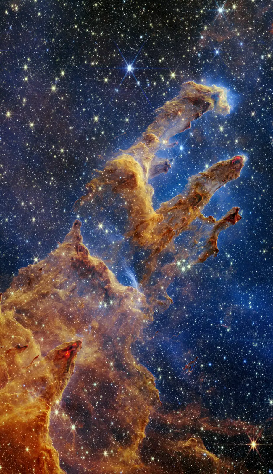
Astronomical cameras often record separate images through filters. Each filter admits a range of wavelengths. Image specialists align and combine these measurements, assigning colors so that the result can be displayed on an ordinary screen.
For a natural-color image, the aim is to approximate familiar visible colors. Other images map infrared, ultraviolet or narrow emission bands into visible colors. Your eyes cannot see infrared, so an infrared portrait has no single literal eye-color version waiting to be printed.
In many Webb composites, shorter measured wavelengths are assigned bluer colors and longer ones redder colors. The exact filters and assignments matter. “Red” in one image does not automatically mean the same temperature or material as red in another.
A nebula’s palette can separate physical ingredients
A narrowband filter isolates a small wavelength range, often associated with light emitted by a particular atom or ion. Assigning different colors to different filters can make structures and gas components easier to distinguish.
This is closer to choosing an informative map legend than coloring a blank scene from imagination. The data constrain where the light is; the presentation determines how a person can distinguish it.
The familiar Hubble-style palette and a broad visible-light image can therefore make the same nebula look different. Neither label by itself tells you whether processing was careful. Read the filter list and explanation on the source page.
Why it looks gray at the eyepiece
A camera can collect light over many exposures. Faint signals can be aligned, combined and stretched so that dim structure becomes visible alongside brighter regions. Our eyes cannot accumulate minutes of light in that way.
At low light levels, vision relies strongly on rods, which are much less useful for distinguishing color than cones. A nebula that looks richly colored in a published image may look like a pale gray patch through a modest telescope. Some observers see subtle color in brighter objects; the result varies with the object, aperture and observer.
The honest comparison is not “real versus fake.” It is a short visual observation versus an instrument’s accumulated, processed measurements.
Read a space picture in five questions
- Who made the observation? Look for the telescope, spacecraft or photographer, not just the reposting account.
- What is pictured? A whole galaxy, a small detail and a stitched panorama imply very different scales.
- Which wavelengths? Visible light, infrared, X-rays or a combination?
- What processing is described? Color mapping, multiple exposures, mosaicking or an artist’s reconstruction?
- Where is the original? Follow the credited observatory’s page for the date, scale, filters and reuse terms.
An image circulating without this information may still be genuine, but you cannot settle that from its beauty alone. Compare it with the mission’s original release before sharing a dramatic claim.
Use two views without confusing them
SkyLumi places real survey photography on the sky map. That lets you connect the faint patch above you with a recorded view of the same region. Its story images are separately credited, and artist’s impressions are labeled as such.
Start with the Orion Nebula or Pleiades. Find the object, compare the photo and read its credit. Knowing why the picture looks that way makes it more interesting, not less.
Sources and image credits
- NASA: how Webb’s full-color images are made. Filters, wavelength-to-color mapping and image production.
- NASA: about Webb images. Original releases, image provenance and misleading circulated images.
- ESA/Webb: Pillars of Creation. The exact instrument, filters, credit and reuse license for this page’s image.
- NASA: Hubble nebulae. Emission and reflection nebulae.
Written for beginners from the sources above. How we research and correct the library. Found an error? Tell us.